Order and shipping analysis
Introduction
As a Business Analyst, I was given a dataset to carry out Sales Order and Shipping Analytics, To gather trends and insights, and give recommendations to the company sales and the Shipping. The purpose of this report is to provide an overview and analysis of the Sales Order and Shipping dashboards for theframe of Jan 2019, to december 2019. These dashboards were created using Excel to provide Sales order and shipping analytics. The dashboards include KPIs such as total orders, customers, products, revenue, unit price, quantity and shipping fee. The dashboards contain various charts and slicers to visually represent the data and help users make informed business decisions
The Steps I took in other to provide trends and insights from the dataset.
- Data Cleaning: Removed duplicates, merging necessary variables to overcome ambuguity.
- Data Manipulation: Did columns' renaming. created columns for months and day.
- Converted the data to a table.
- Data Visualization Created reports using Pivot table and visualized my reports via charts.
- Designed my dashboards with the most important metrics.
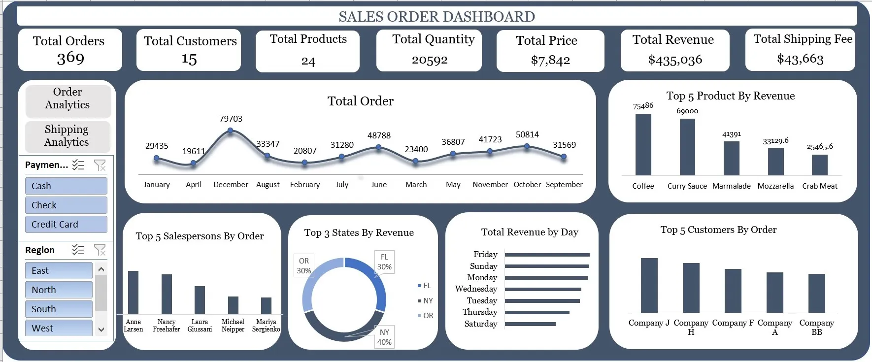
The Order Analytics dashboard provides a comprehensive view of sales order analytics. The dashboard includes important charts that provide insights into sales order trends, salespersons' performance, revenue by state, revenue by day, top customers by order, and top products by revenue.
- "Total Order with Month," shows the total number of orders per month. This chart indicates that the highest number of orders were made in december. This could be due to seasonal factors such as holidays, promotions, or discounts., while the lowest number of orders were made in April.
- "Salespersons by Order," shows the performance of salespersons. This chart indicates that Salesperson Anne Larsen has the highest number of orders indicating that this salesperson is highly efficient in generating sales, followed by Salesperson Nancy Freehafer and then Salesperson Laura Giussani.
- "States by Revenue," shows the revenue generated by states. This chart indicates that NewYork generated the highest revenue, followed by Oregon, and Florida.
- "Revenue by Day," shows the revenue generated by day. This chart indicates that the highest revenue was generated on the fridays and Sundays of the each month, while the lowest revenue was generated on the Thursdays and Saturdays of the each month.
- "Top Customers by Order," shows the top customers based on the number of orders. This chart indicates that company J has the highest number of orders, followed by Compnay H and then Company F.
- "Top Product by Revenue," shows the top products based on revenue. This chart indicates that Coffee generated the highest revenue, followed by Curry Sauce and then Marmalade.
- The majority of customers choose to pay with credit cards, followed by Checks and Cash.
Shipping Analytics Dashboard
The Shipping dashboard provides a comprehensive view of shipping analytics. The dashboard includes charts that provide insights into product shipment trends, revenue by ship name, revenue by ship city, shipping fee by product & Category, and shiiping fee by ship state, Product, and customer.
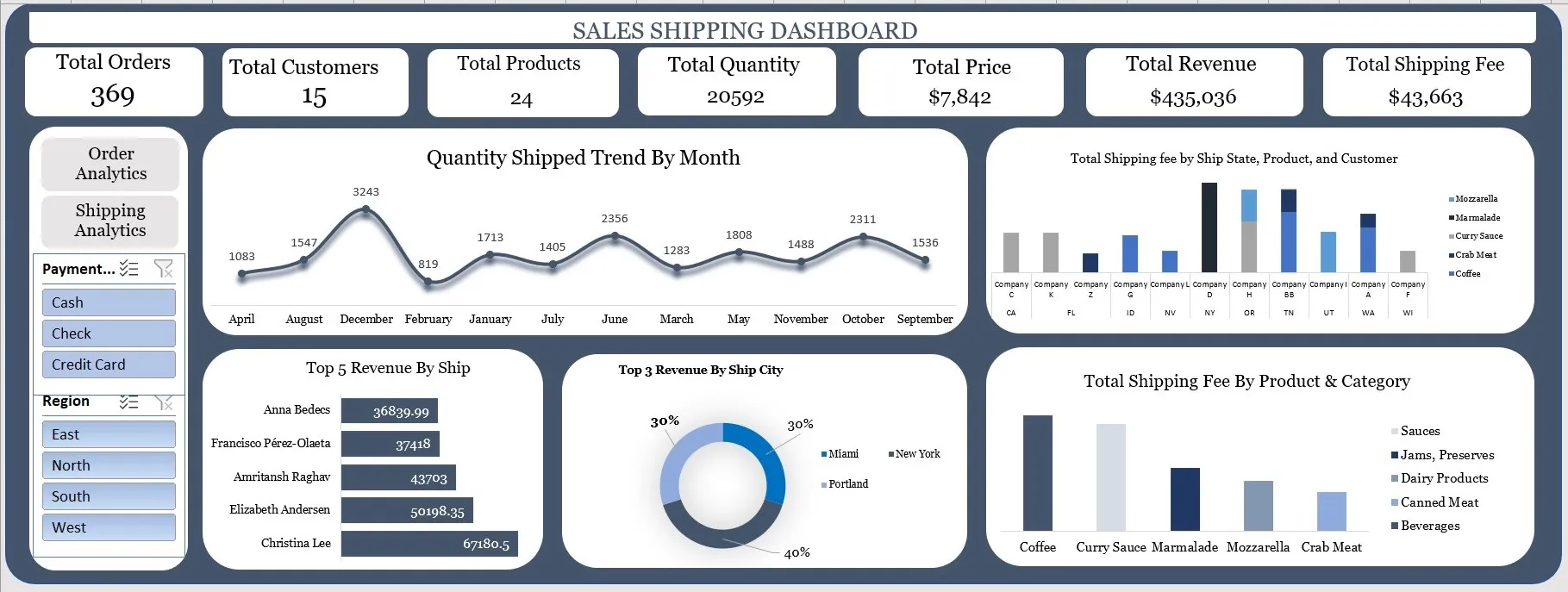
Trends and Insights
- "Quantity of Products Shipped by Month," shows the total quantity of products shipped per month. This chart indicates that the highest quantity of products were shipped in December, while the lowest quantity of products were shipped in February.
- "Revenue by Ship Name," shows the revenue generated by ship. This chart indicates that Christina Lee generated the highest revenue, followed by Elizabeth Andersen and then Amritansh Raghav.
- "Revenue by Ship City," shows the revenue generated by ship city. This chart indicates that New York generated the highest revenue, followed by Miami and Portland with same percentage.
- "Shipping Fee by Product Category," shows the shipping fee charged for each product Category. This chart indicates that Beverages (Coffee) has the highest shipping fee, followed by Canned Meat (Curry Sauce) and then Jams Preserves (Mozzarella).
- "Shipping fee by ship state, product, and customer," shows the shipping fee charged for each product ordered by each customers and the ship state. This chart indicates that only Company D ordered Marmalade to New York has the highest shipping fee , followed by company H, that ordered curry sauce and Mozzarella to Oregon and then company BB, that ordered Coffee, and Marmalade to Tennessee