Financial Dashboard Report: Unlocking Insights for Informed Decision-Making
Introduction
In this report, I present a comprehensive analysis of financial data using Power BI Financial Dashboard. This dashboard gives key stakeholders real-time insights into the organization's financial performance. By leveraging the power of data visualization, I aim to equip decision-makers with the tools they need to make informed and strategic choices to drive the company's success.
Page 1: Headline
Trends and Insights:
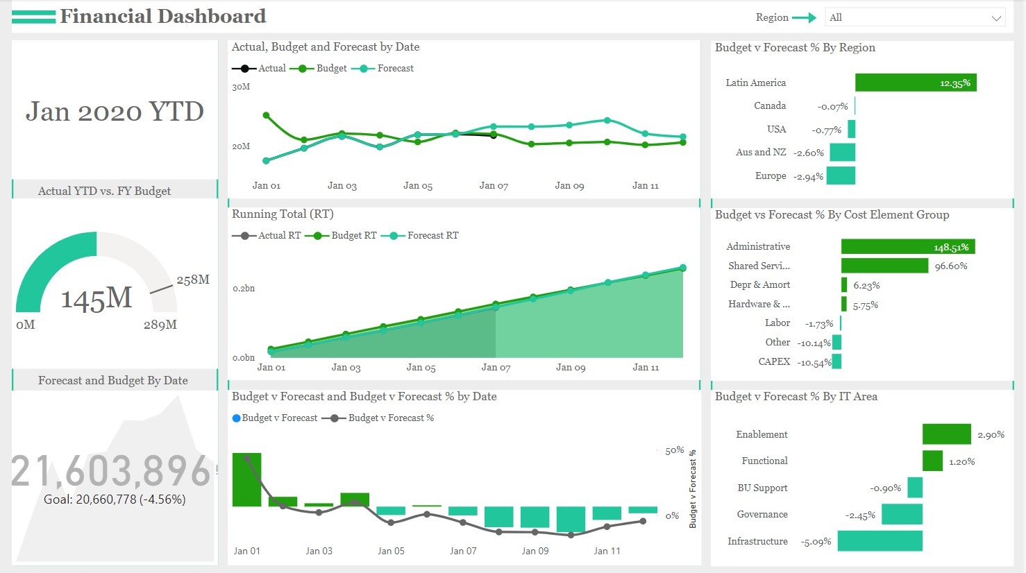
- Actual YTD vs. FY Budget: Using an interactive gauge chart, the dashboard clearly shows our year-to-date (YTD) performance compared to the full-year (FY) budget. This visualization lets us quickly assess whether we are ahead or behind our budget targets. Early in the fiscal year, we observed a gap between actual performance and the budget, but through diligent efforts and cost optimization, we successfully narrowed this gap.
- Forecast and Budget by Date - KPIs and Line Chart: Our dashboard features KPIs that provide a snapshot of forecasted and budgeted amounts for each reporting period to ensure we stay on track. This enables us to monitor any deviations from the projected values. Our forecasting accuracy has improved over time, allowing us to make more accurate budgetary projections.
- Running Total of Actual, Forecast, and Budget - Area Chart: The area chart displaying the running total of actual, forecast, and budgeted amounts showcases our financial trajectory throughout the fiscal year. Our actual cost and forecasted values have consistently outperformed our budgeted targets, indicating favorable market conditions and effective cost management.
- Budget vs. Forecast and Budget vs. Forecast % - Line and Clustered Column Chart: By comparing our budget and forecast, we gain valuable insights into the accuracy of our financial planning. We observed that while our forecasts have been relatively accurate, there are certain cost elements where we tend to underestimate expenses. The clustered column chart of budget vs. forecast % helps us pinpoint areas that require further attention and budget adjustments.
- Budget vs. Forecast % by Region and Element Group - Clustered Bar Chart: Our dashboard highlights the budget vs. forecast % breakdown by region and cost element group. This reveals that some regions have consistently outperformed their forecasts while others are experiencing challenges. Similarly, specific cost element groups have exceeded their budget, leading us to investigate the underlying factors for these variances.
Page 2: Region
Trends and Insights:
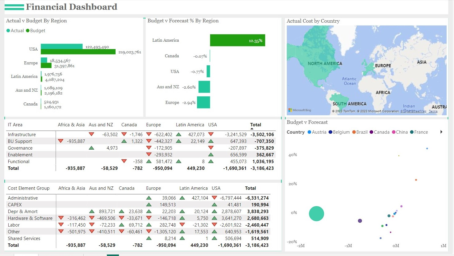
- Actual and Budget by Region: The clustered bar chart comparing actual and budgeted amounts across different regions provides a clear view of regional performance. We can identify regions that are consistently meeting or exceeding budget targets, as well as those that require attention to align their performance with organizational goals.
- Budget and Forecast % by Region: The bar chart displaying budget vs. forecast % by region offers valuable insights into our forecasting accuracy in different regions. We can leverage this information to optimize regional budget allocation and better align resources with market potential.
- IT Area, Region, and Budget vs. Forecast - Matrix: The matrix highlights a detailed view of budget vs. forecast for different IT areas in various regions. This allows us to identify the IT departments that are contributing most significantly to budget variances, helping us focus on specific areas for improvement.
- Cost Element Group, Region, and Budget vs. Forecast - Matrix: This matrix analyzes budget vs. forecast for different cost element groups across various regions. It helps us understand which cost elements contribute most to budget deviations, guiding our efforts in optimizing spending.
- Budget vs. Forecast by Budget vs. Forecast %, Country, and Sum of Forecast - Scattered Chart: The scattered chart visually represents the relationship between budget vs. forecast and the corresponding budget vs. forecast %, country, and sum of forecast. This aids in identifying any patterns or correlations that may exist between these metrics.
Page 3: Decomposition Tree
Trends and Insights:
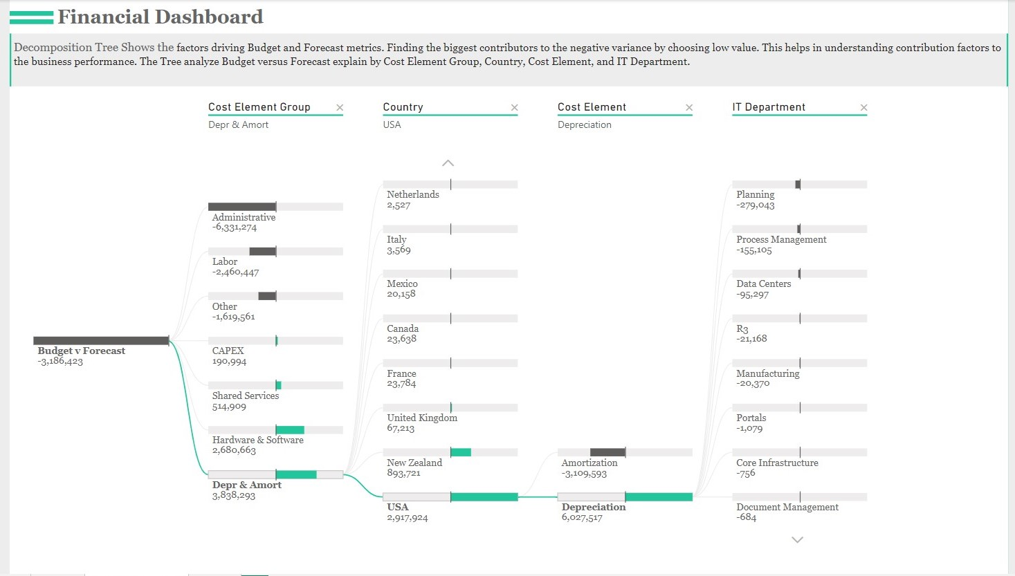
- Decomposition of Budget vs. Forecast by Cost Element Group, Country, Cost Element, and IT Department: The decomposition tree helps us understand the underlying factors driving budget vs. forecast variances. It reveals which cost element groups, countries, cost elements, and IT departments contribute most to these variances. This knowledge empowers us to take corrective actions and refine our budgeting and forecasting processes.
Conclusion:
In conclusion, Financial Dashboard is a powerful financial analysis and decision-making tool. By providing real-time insights, interactive visualizations, and trend analysis, we are better equipped to make data-driven decisions that positively impact our organization's financial health. We have identified areas of strength, such as accurate forecasting and cost optimization, as well as areas that require attention, such as specific regions and cost element groups with budget variances.